
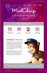
Creating your own customized emails is a way to make your content shine for clients and potential customers. Creating a custom-coded email within MailChimp’s editor is actually pretty simple.
Preparing the design
Before you even open your text editor you should prepare the design you’re working from. The best way to do this is using the Photoshop guidelines. This serves two purposes; first, you can see where and how you’re going to slice the images, second, it helps you imagine the html structure for the build. We can already see how the table structure will look like.
Preparing your HTML document
Use this as the skeleton of your template:
<!DOCTYPE html PUBLIC "-//W3C//DTD XHTML 1.0 Transitional//EN" "http://www.w3.org/TR/xhtml1/DTD/xhtml1-transitional.dtd">
<html xmlns="http://www.w3.org/1999/xhtml">
    <head>
        <meta http-equiv="Content-Type" content="text/html; charset=UTF-8">
        <meta name="viewport" content="width=device-width, initial-scale=1.0">
        <title>*|MC:SUBJECT|*</title>
        <style type="text/css"></style>
</head>
    <body>
        <table border="0" cellpadding="0" cellspacing="0" style="margin: 0; padding: 0" width="100%">
        <tr>
            <td valign="top"></td>
        </tr>
    </table>
    </body>
</html>
Head Section
This is a very important part of the email template build process. First off, we’ll be adding a set of client-related fixes. Not much to talk about here, these fix a few small bugs and quirks across different email clients. We add these inside our style tags in the head section.
/* Some resets and issue fixes */
#outlook a { padding:0; }
body{
    width:100% !important;
    -webkit-text;
    size-adjust:100%;
    -ms-text-size-adjust:100%;
    margin:0;
    padding:0;
}
.ReadMsgBody {width: 100%;}
.ExternalClass {width:100%;}
.backgroundTable {
    margin:0 auto;
    padding:0;
    width:100%!important;
}
table td {border-collapse: collapse;}
.ExternalClass * {line-height: 115%;}
/* End reset */
Next up, since our email template requires us to be using web fonts, we’ll need import these like so:
<link href="https://fonts.googleapis.com/css?family=Roboto:300,400|Open+Sans:400" rel="stylesheet" type="text/css">
Hero Section
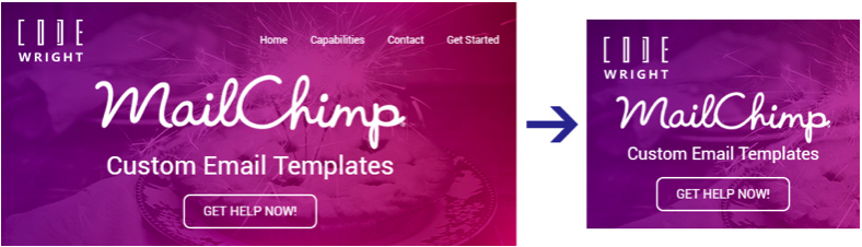
<table width="600" cellspacing="0" cellpadding="0" bgcolor="#8a208c" class="w100p">
The container table is 600 pixels wide. It has a class of w100p which forces it to 100% width on smaller screens.
The next bit is a bit more tricky. This is controlling the background image. As we know, Outlook doesn’t support background images, so we’ll use the VML hack.
<td background="images/hero.jpg" bgcolor="#8a208c" width="600" valign="top" class="w100p">
    <!--[if gte mso 9]>
        <v:rect xmlns:v="urn:schemas-microsoft-com:vml" fill="true" stroke="false" style="width:600px;"> <
            v:fill type="tile" src="images/hero.jpg" color="#8a208c" />
            <v:textbox style="mso-fit-shape-to-text:true" inset="0,0,0,0">
<![endif]-->
Next, we’ll add the logo and nav section. The logo table cell is 50% width, and blows up to 100% width on smaller screens.
<td align="left" width="50%" class="w100p"><img src="images/logo.png" width="75" alt="Logo" border="0" style="display:block"></td>
And here is the navigation section:
<td width="50%" class="hide" align="right" style="font-size:12px; color:#FFFFFF; font-family:'Roboto', Arial, sans-serif;"><font face="'Roboto', Arial, sans-serif"><a href="#" style="color:#FFFFFF; text-decoration:none;">Home</a> <a href="#" style="color:#FFFFFF; text-decoration:none;">Capabilities</a> <a href="#" style="color:#FFFFFF; text-decoration:none;">Contact</a> <a href="#" style="color:#FFFFFF; text-decoration:none;">Get Started</a></font></td>
You’ll notice the font face=”‘Roboto’, Arial, sans-serif” tag, this is used so Outlook will display our web font fallbacks.
Now, lets move onto the Heading and CTA. Mostly, it’s just spacing. Lets take a peek at the CTA:
<table border="0" cellpadding="0" cellspacing="0" style="border:2px solid #FFF; border-radius:8px;">
    <tr>
        <td align="center" valign="middle" style="color:#FFFFFF; font-size:15px; line-height:150%; padding-top:7px; padding-right:21px; padding-bottom:7px; padding-left:21px; text-transform:uppercase;">
        <a href="#" target="_blank" style="color:#FFFFFF; text-decoration:none;">Get Help Now!</a>

</td> </tr>
</table>
We’ve added a border to the table that surrounds the CTA to give it a bit of style.
We just need to add some media queries inside our <style> tag, and we’re done with the hero section.
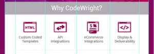
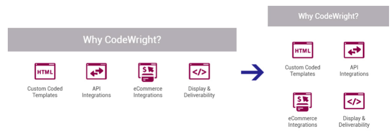
Building the icon section
We’re going to be separating the gray bar away from the icon grid for the sake of ease.
<table width="600" border="0" cellspacing="0" cellpadding="15" bgcolor="#c1bdc1" class="w100p">
    <tr>
        <td align="center" style="font-size:26px; color:#FFFFFF;" class="hero-heading"><font face="'Roboto', Arial, sans-serif">Why CodeWright?</font></td>
    </tr>
</table>
We then have a 600 pixel table that’s forced into 100% on smaller screens. The cellpadding=”30″ gives us an easy way of adding 30 pixels padding around all sides of it that remains consistent across devices. Inside the table we have the return of the font.
We’ve divided the icons into 2 tables with 2 icons each, which will stack nicely on small screens.
<table border="0" cellspacing="0" cellpadding="0">
    <tr>
        <td width="115" align="center"><a href="#"><img src="images/icon-1.png" border="0" style="display:block;"></a></td>
        <td width="20"></td>
        <td width="115" align="center"><a href="#"><img src="images/icon-2.png" border="0" style="display:block;"></a></td>
    </tr>
</table>
We simply duplicate up what we have above to create the second column and get a lovely, 2×2 grid. Here is how they compare side-by-side:
Building the bottom section
Next up we’re going to build the bottom section.
First up the white text block which is rather simple.
<td align="left" valign="top" style="font-size:16px; color:#5e5d5e; padding:35px 20px;"><font face="'Roboto', Arial, sans-serif"> <span style="color:#5e5d5e; font-size:22px;" class="w100pb"><span style="color:#991971;">CodeWright</span> + <span style="color:#3d87bf;">MailChimp</span></span><br><br><span style="font-size:12px;">We understand the issues that arise when sending an email to a multitude of devices, especially when you need to integrate systems essential to your business. With our team of developers, you can count on our code to get your emails where they need to go and make sure they look good when they get there.<br><br>With 16 years years of experience in custom development, CodeWright can make sure your emails display properly across all platforms, your systems are connected, and all your emails get to their destinations.</span></font> </td>
Next up is the image which is also, very simple!
<td valign="top" style="padding-top:35px;" class="w100pb"> <img src="images/mailchimp.png" alt="" width="298" height="365" style="display:block;">

</td>
The next section is very similar with the gray bar above the icons section.
<table width="600" border="0" cellspacing="0" cellpadding="0" bgcolor="#c1bdc1" class="w100p">
    <tr>
        <td align="center" style="font-size:15px; color:#ffffff; padding:25px 10px;"><font face="'Open Sans', Arial, sans-serif">Check out our blog article on <a href="#" style="text-decoration:none;"><span style="color:#FFF; text-decoration:underline;">Creating Custom MailChimp Email Templates!</span></a></font>
        </td>
    </tr>
</table>
And now the last section. This is just the same as the other ones but with different colors.
Importing the template in your Mailchimp Account
After logging into your Mailchimp account, click on Templates, then click on Create Template button. Click on Code your own tab, and you have 2 options:
Select Paste in code, and just paste the html code from your html file
Select Import zip, and upload the zip file with your html file and images